One of my research interests is to make sense of complex social configurations through the use of data visualisations. This page is intended as portfolio of data visualisations and infographics I personally designed or which are part of my research.
City ≠ City
While empirically or theoretically not often thought about most of us would have a hunch, that different cities attract different migrants. This is important for making sense of diversity dynamics. Using German Statistics on the immigration statuses of migrants this waffle visualisation shows well that German cities by no means exhibit the same immigration status distributions. This raises questions about how these patterns are relevant at the neighbourhood level and how cities might be able to make sense of their very specific diversity dynamics in light of (national level) regulations of migration. This is a question I am trying to answer with Dutch data as part of my Marie Curie Fellowship at the TU Delft. The German data is part of an article I am working on at the moment.
Fun & Games
This was a ‘fun’ project I called: SanD Castle – Data visualisations with Sand. Warnemünde in the North of Germany offered the perfect location for experimentation. Here we can see the gender distribution of the Rostock Retreat for Data Visualisation.
Neighbourhood ≠ Neighbourhood
More seriously at the Rostock Retreat I also wanted to visually show, that there are stark differences in how migratory neighbourhoods are and that there are high migrant concentration neighbourhoods, that see little population turn – as well Migrant neighbourhoods that see a lot of turnover. Using data from the city of Kassel this visualisation shows that broken down to small area statistics there is quite a bit of variation of how migratory ‚migrant-neighbourhoods’ are.
Process of Legal Status Diversities
The graphic below is included in my article on legal status diversity published in the Journal of Ethnic and Migration Studies, using a novel way of representing changes in the numbers of visa issued to migrants in different visa categories (for the purpose of work). The graphic gives insights on how policy interventions change access to particular immigration statuses and that this leads to different immigration statuses being more or less salient over time. Read the article to learn more about the conditionalities of entry and parameters of presence and why I think both are highly important for making sense of diversity dynamics.
Visualising Diversity
This is the key visualisation from my PhD thesis it is an abstract representation of how we can understand migration related diversity as both multi-layered and in relational terms. The graphic displays the different patterns of homophily each associated to one of my 55 respondents. Homophily scores measure how much a focal individual is the same as his or her social contacts on some aspect.
Each column shows information about one personal network and the colour of each of the rectangles in the rows describes the proportion of social contacts a respondent named who were in the same category as her or him. The darker the shading the more alike that respondent was with his or her social contacts, This ‘heat map’ thus allows to display multiple aspects of superdiversity in a relatively simple way that does, however, not reduce the complexity of relational diversity. Click the image for a larger and interactive version.
Moving from more places to more places
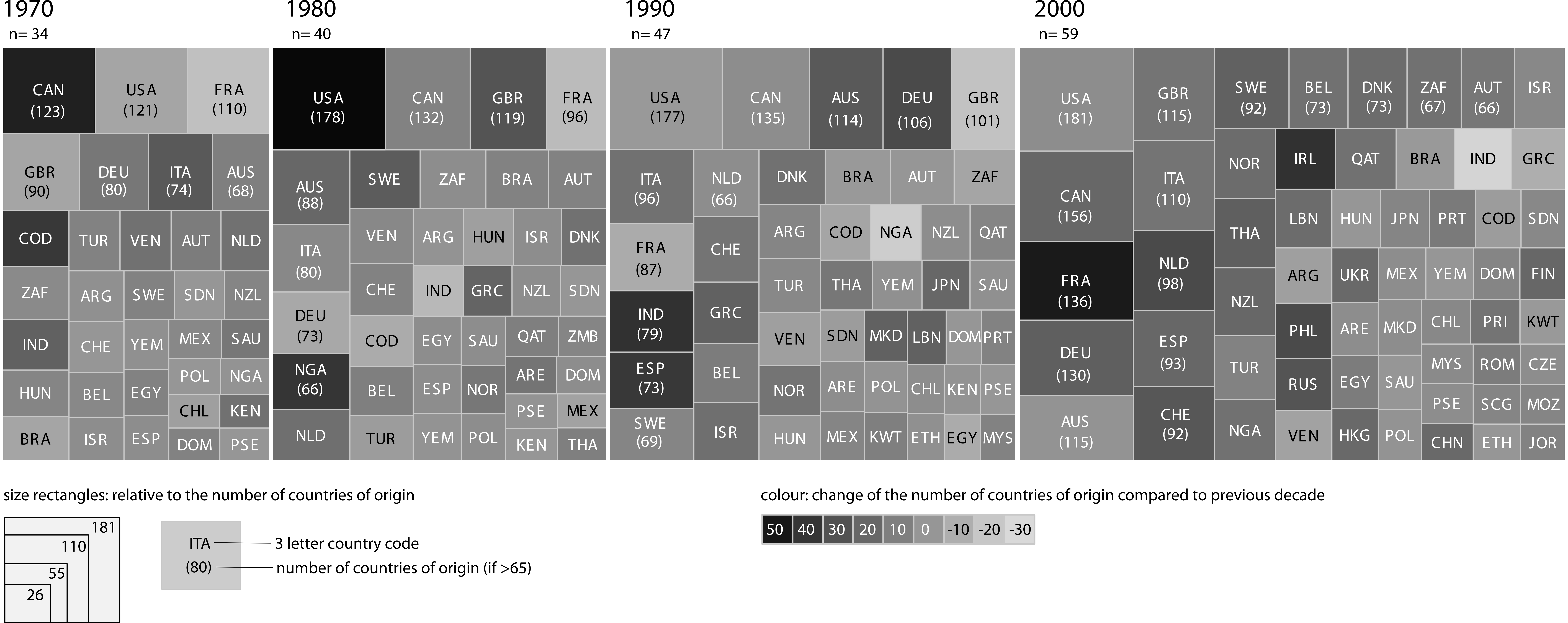
This graphic taken from a recent publication in Ethnic and Racial Sudies shows the increases in migrant origin groups in different countries:
“[The graphic] portrays four decades of migration diversification. Each larger rectangle represents one decade and is subdivided into smaller rectangles. Each smaller rectangle shows one country; the size of each smaller rectangle reflects the number of countries of origin for migrants (here with at least 500 people per country of origin). Only those countries with at least twenty-five different groups are included in the figure. Over the decades, we can see a clear, worldwide rise in the number of migrant countries of origin experienced in many countries of the world; the small rectangles in 2000 are more numerous (more countries count more than twenty-five groups of more than 500 individuals) and the size of the decennial rectangle also increases. In addition, Figure 1 shows that these processes of diversification are dynamic and that some countries – granted fewer – are shaded lighter, indicating a decrease in the number of groups from one decade to another. (Meissner and Vertovec 2014: 3)”


